

Perpetual Education: Week 12
Perpetual Education: Week 12
Lessons 105 - 112

Sup foo?
I escaped Portland. I no longer have to stuff shirts under my door to keep the smoke out. I no longer have to hold my breath when using the bathroom. I no longer have to wear sandals in the shower. It’s weird to be the responsible one. I’m suppose to be the degenerate dammit! Hopefully my new living situation will put me back in my rightful place.
Took the Amtrak from PDX to SAC. I loved using the observation car for studying. Massive windows, quiet atmosphere, beautiful scenery. I feel like I got a glimpse of my ideal future — being productive and earning a living while having a unique traveling experience.
Got my next adventure lined up — a room in Bernal Heights. I’m excited. Awesome neighborhood right next to the mission (where I can get my daily burrito fix). It’ll be cool to be in the thick of it while studying this stuff.
Gabba Gabba GIST...
Super Ultra Responsive Layout and Theming Challenge
I had to recreate a responsive layout while only referencing a video. A bit of a different process but still relative to how I’ve worked in the past.
First I watched the video very slowly so I could look out for media queries and take screenshots. I used a screenshot of the whole page so I could figure out a game plan for writing the HTML.
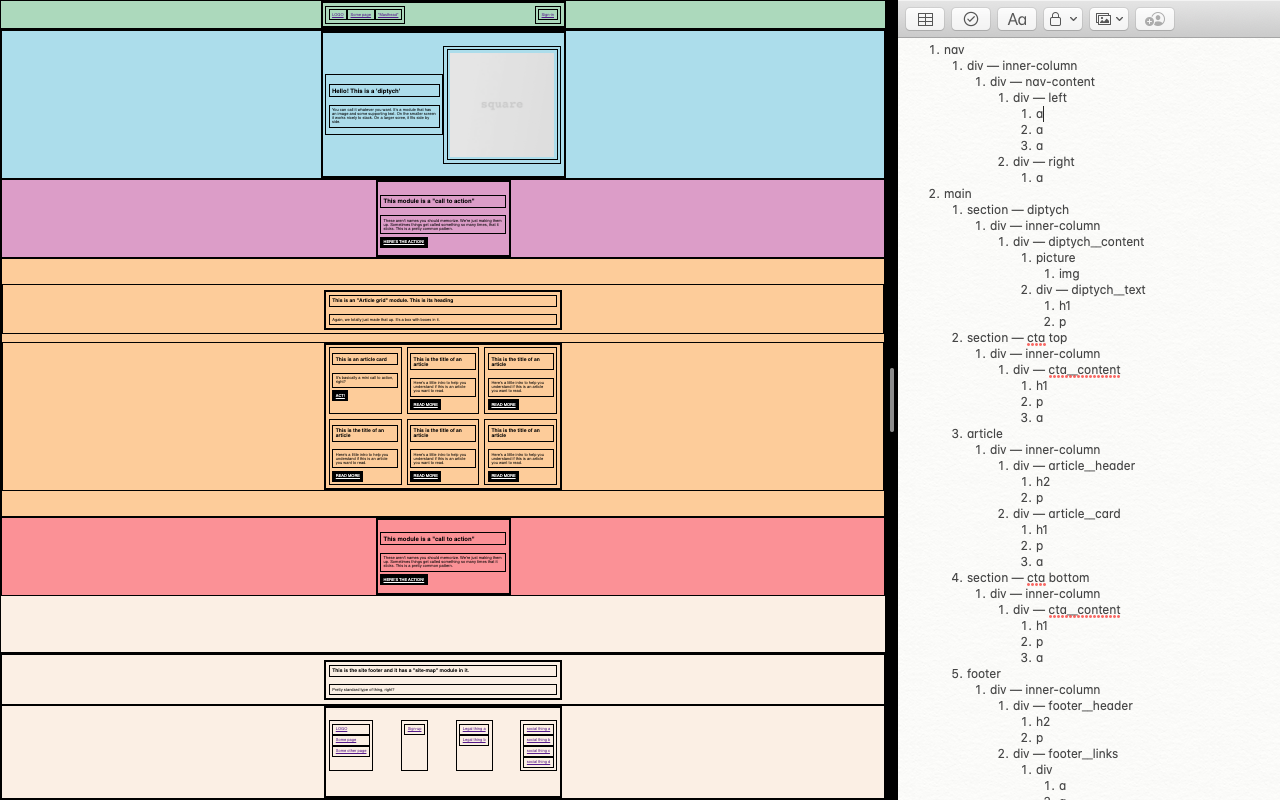
A little preparation goes a long way. Now I could clearly how to structure the HTML. I used emmet to write a majority of it (which was super fun) and opengraph for the <meta> tags. Also used ColorPick Eyedropper to grab the colors.
I’m surprised how smoothly this lesson went. Everything clicked and I did it all in one sitting. Check it out!
Finalizing the Base Code and Code Review
Something we’ve been doing lately is having more group meetings. I think these have been very beneficial for everyone.
Since we all coded the responsive layout on our own we were able to compare and learn from each others processes. In the end our code was fairly similar but we did run into the same problems.
Moving forward we’ll be working with Derek’s code for the responsive layout challenge and only altering the CSS to create themes. There’s a lot to unpack for how he structured the partials and css files but it all makes sense. Just have to follow the flow of the document from the index. Good to reference for later. He also showed us some past students work to see how versatile the styling can be.
Research
Since I’m in the market for an electric bike and have been looking at a lot of those websites recently I decided to use that as my theme.
I compared the sites for 6 different companies:
Lots of similarity in design:
Headers
A little bar up top for a sale item or to express an urgency to buy.
Logo + nav links (standard stuff).
First section
Background image with centered text.
Second section
Either a background image or an image off to the side with a block of text on the other.
Products section
The styling was a bit unique for each website but still pretty standard in layout (e.g. photo, title, quick info).
Majority of the sites had a grid layout like Amazon.
Super73 and juiced had a gallery style layout.
Each website had a pretty basic color scheme. Black, white, grey, maybe an orange red for the links or to highlight buzz words.
I did a little too much research. You can see it here.


Style Tiles
I’ve done my research. I’ve looked for similarities across all the sites. Now I need to mix and match certain aspects of the design to formulate some style tiles.
Still did the style tiles wrong but this is what I got…

Kept the colors basic (black, white, grey). All fonts are sans-serif. Hover states were originally orange-red but I decided to alter the color so they stuck out more when against grey background.
You can sort of see how I combined certain aspects of the design to create this one…
The top image is from Van Moof. I like the way the shape of text content plays off the image. Sort of wraps around the back wheel. The bottom image is from Cube. I like the subtle background of the topographic map. Left is my frankesteined version.
Tiles to Styles
I styled the first version of the theme challenge based on the 2nd and 3rd style tiles.
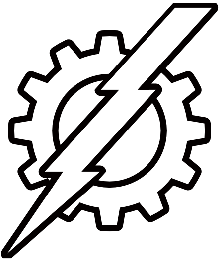
I also needed to throw together a logo but I didn’t want to get stuck in design hell while doing so. Luckily Affinity has a variety of tools for creating unique shapes on the fly. I used the cog tool to resemble a bike gear and 2 squares and an upside-down triangle for the lightning. Used the add function to combine the shapes of the lightning and adjusted the shear ratio to give it an angled look. Had to make a few different version because I wanted the stroke width to match the thickness of the letters it’s right next to. Here’s what I whipped up.
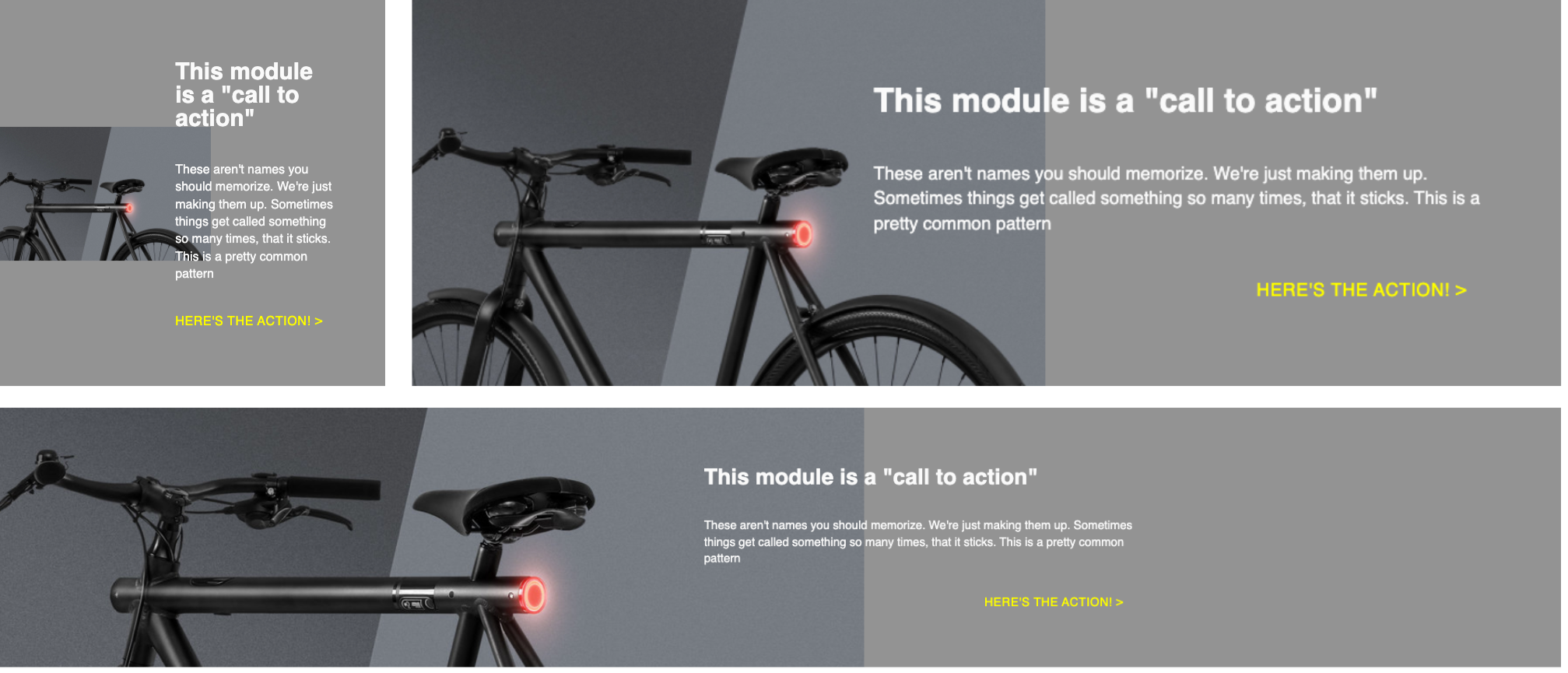
Ran into some into a happy mistake while trying to emulate a section based on the 2nd style tile. The background-image looks pretty cool at all sizes while scaling in an interesting way. I actually like it better than the style tile.
Since I was strapped for time, I was pretty reckless with writing the CSS. I’ve definitely notice that I’m little less tedious with my code overall. Might be a bit sloppy but at least my output is faster. I can always worry about cleaning it up later. I think right now it’s about having a quick turnaround time for a working model.
This past week was a bit rough. Taking those 2 weeks off from coding really flattened my tires. I need to get with it. Factor in the chaos of moving and searching for a new place too. Today I finally feel like I’m back to normal. Now I got to stick with it for the rest of the course. Note to self: Code every day or else you’ll forget everything.
Gist out.
🙏 T H X 🙏
"Come with me, and you'll see, THE INTERNET IS FULL OF DIV ABOMINATIONS!"
Love these cover photos you make!
And totally agree about keeping up with the code all the time. Darwin's law of use and disuse. Use it or lose it!