

Perpetual Education: Week 13
Perpetual Education: Week 13
Lessons 113 - 119

👋
I’m back. Yes, I know. This blog is a week late. I felt like absolute crap from Sunday to Thursday last week. Don’t know if it was COVID or the flu but I was bedridden for 2 of those days. My insides felt like sand. At least my voice sounded cool (in my head). I should’ve recorded a bunch of Tom Waits songs.
I was in limbo at my Mom’s til the move to SF. It’s weird revisiting my old stomping grounds. A bunch of the sketchy dudes I knew in high school are super domesticated now. Is this a good thing? Is this defeat? I was a complete fishouttawater (see what I did there?) at my Niece’s birthday party. I couldn’t hold a conversation with the people my age for the life of me. I’m such a freak in suburbia. I need to get my ass to SF quick!
My Mom made me watch Squid Game. Thought it was great til the last episode. Too drawn out and melodramatic. I am a little worried that my Mom found joy in witnessing the pain of others though.
Welp on with the gist…
Main Theme and Style Tiles
Still struggling with these. So weird. I always thought that some wacky programming concept would be the thing that trips me up but style tiles it is. Style… tiles… still hate saying that. Sounds like some additional accessory to a trapper keeper or something you’d buy at Claire’s. I feel like that waiter from Office Space when I say it. It’s not a good feeling. Welp I better get used to these because they’re crucial to the design process. Trying to keep a good attitude. Keep reading and you’ll see how much I suck at these.
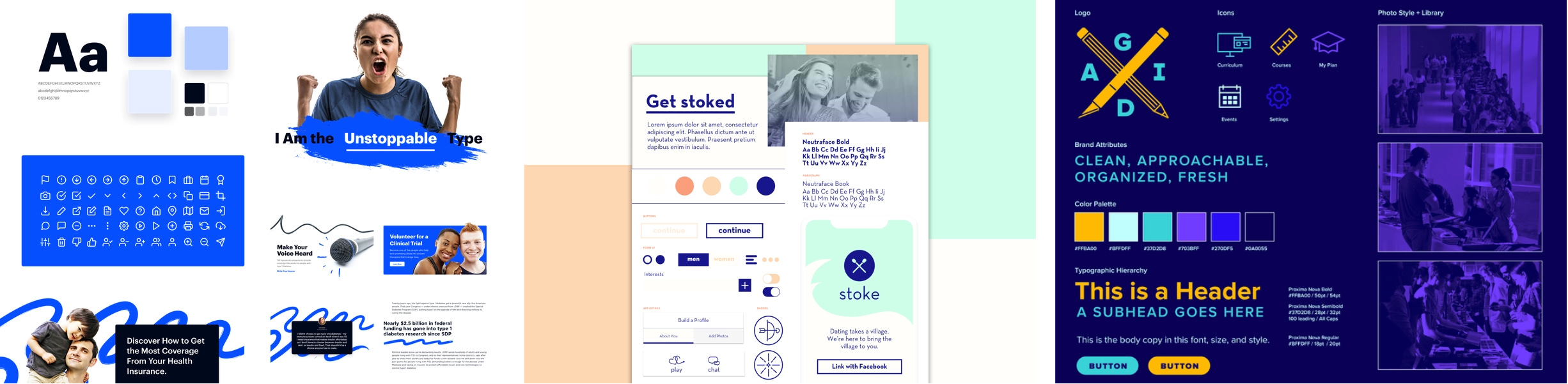
I looked for some already existing style tiles that seemed pretty effective to me. These show the type, font styling, color palette, images, icons, buttons, & hover effects.
At this point in the course I should be able to whip something up fast. I took my research from the week prior and formatted based on these kind of style tiles. This is what I came up with…
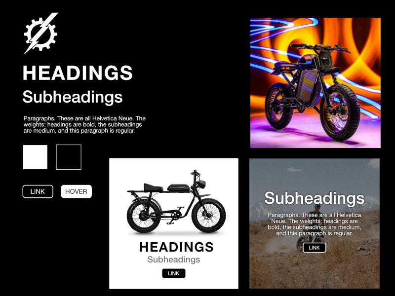
Got my logo, buttons, hover states, text styling, layouts for article card and diptych, and a color palette. Seemed like I checked all the boxes that make up a style tile, right? No. Total fail.
Here are some highlights from my beating…
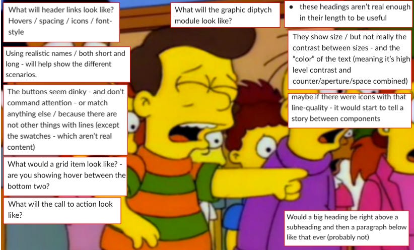
I did get one good hit in though.

So I took all that feedback and tried starting from square one but what I forgot to do was actually make a style tile. I just made a straight-up mockup of the whole page. Way more work than I needed to do.

The failure continues. Sort of jumped on the gun on the design process. Yes, I got a mobile mockup in place that does a pretty good job of showing my ideas but that wasn’t the point. I could’ve saved myself a lot of time if I stuck with the style tile format. The point with style tiles it to create a bunch of them in like 10 minutes or less. It’s so that you and the client can get on the same page before deep diving into anything. What I should’ve done with this round is take Derek’s feedback and just make some subtle changes to the already existing style tile or start one from scratch. Therefore my existence is meaningless (jk).
The boss suggested that I quickly reverse-engineer the mockup into a style tile. This is what it should’ve been…
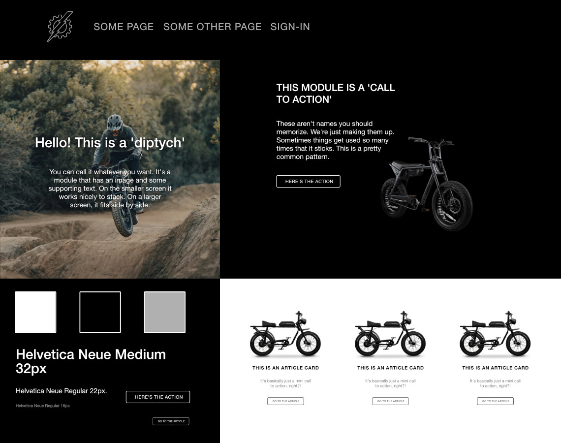
See how I could’ve saved myself a headache? All I needed were some quick alterations but no, my dumb ass had to jump the gun.
Lessons learned:
Style tiles are your friend.
Use them to save yourself time.
Use them to get on the same page as the client.
Don’t jump the gun.
Kill my ego.
Show more humility.
Ask questions to see if I actually understand WTF I’m even doing.
Don’t punch the mirror every time I see my reflection.
Now that I got my style tile approved I went forward with the site design.
The CTA (call to action) module got a mixed response. Looks good on mobile but weird on desktop. Also it kind of veered off the path of designing based on research. Brian pointed out that the bike, although cool is a little distracting too.
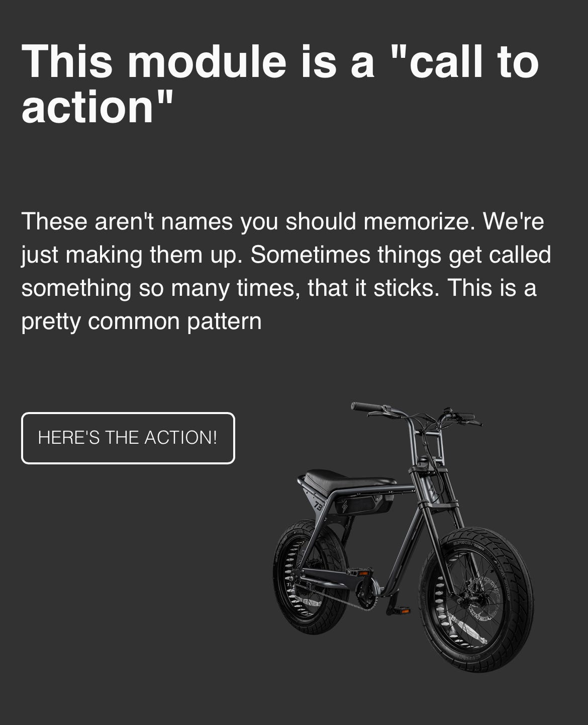
I tried all this wacky stuff with sizing but decided to just ditch this PNG of the bike and just work with a background image that was more inline with my mockup. I also wanted use different images for each CTA.
For the next round of styling I just found images that would better as a background. Also used linear-gradients with the image to lower the opacity and set the color that it blends with. Pretty cool!
background-image: linear-gradient(rgba(50,50,50,0.7), rgba(50,50,50,0.7)), url(../images/ebike-images/cta-6.png);
Hey, not gonna win any awards but it’s better than what I had before.
Traveling and Studying
On Tuesday I had to head into SF to check out some rooms to rent.
Amtrak was great for studying. Got a lot of work done while enjoying the beautiful scenery. I thought I could do the same on the Greyhound from Sac to SF. Nope.
I couldn’t type at all on the bus. Way too bumpy. My fingers were flying all over the keyboard. I gave up like 20 minutes in.
Note to future self: If you’re working remotely and are short on turnaround time, don’t take the bus.
Video Background
A lot of the students needed video backgrounds for their themes. Although I didn’t need one for mine, it was cool to learn.
<video autoplay loop muted>
    <source src="" type="">
</video>
HTML says to the computer “autoplay, loop, and mute the video. Get the video from the src attribute in the source tag.” The type attribute specifies which media type the file is.
video {
    display: block;
    object-fit: cover;
    width: 100vw;
    height: 100vh;
    position: absolute;
    top: 50%;
    left: 50%;
    transform: translate(-50%, -50%);
    z-index: -1;
}
CSS says to the computer “Make the video a block-level element. Maintain its aspect ratio while filling its entire content box, which is the full size of the viewport. It needs to be centered and behind everything else too. BTW Why the hell you still using IE? Get with it man. You’re really screwing us here.”
Of course there’s a lot you can do once you integrate video into your sites it’s easy to get carried away. Dos Equis.
Flickity
Derek suggested I convert the products section of my site from a grid layout to a gallery.

Never tried this before but with the power of flickity this was fairly easy to pull off (calm down ego). All I had to do was add a few elements and attributes in the html file…
<link> tag in the head.
<link rel="stylesheet" href="https://unpkg.com/flickity@2/dist/flickity.min.css"><data-> attribute on the container housing the products. In this case it’s <article-grid>. There’s a few different options available but the value sets the style of gallery.
<article-grid data-flickity='{ "wrapAround": true }'><script> tag right before the closing </body> tag.
<script src="https://unpkg.com/flickity@2/dist/flickity.pkgd.min.js"></script>The ease of this process has raised my suspicions… like what’s the catch? Usually there’s a huge mess of issues. Either way, thank you flickity for making life a little easier.
Another gist in the hole. Another blog is coming soon so I’ll be back on track. Thanks for reading whoever you are. I’m fully back on the coffee. Cup number 3, here I come.
👋
Great read, my friend. I find style tiles challenging as well, but they do help me organize my thoughts. Cheers!
"Style tiles" - we'll just have to come up with a name that doesn't make everyone wince. Samantha won't mind.